
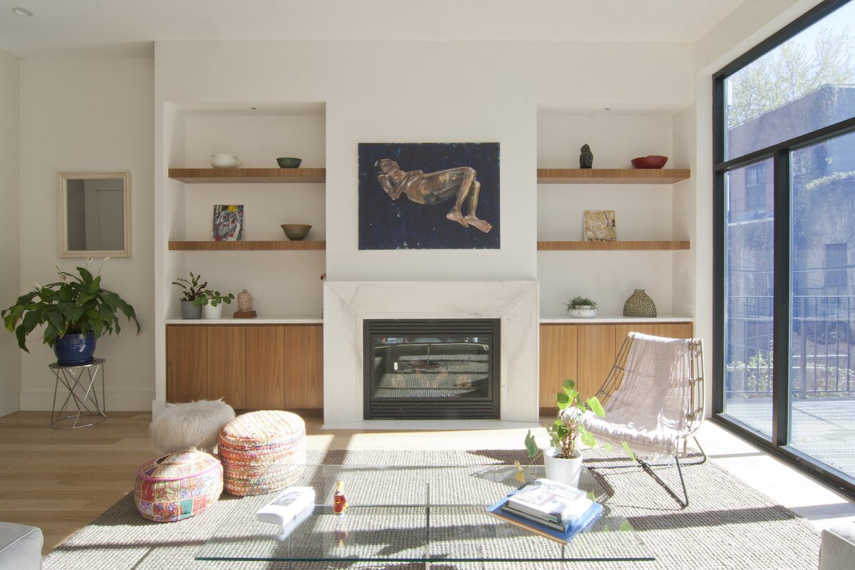
Six Tips to Picking the Right Paint Color

Photo by Clay Banks on Unsplash

Photo by Clay Banks on Unsplash

Think back to the last time you painted a room in your home. Odds are you spent more time than you thought possible combing through color swatches in the paint department. You brought home a pocketful, or more, and taped them up on the wall to ‘live’ with them for a few days. Maybe more than a few days. Perhaps you’re still considering those swatches today. 

It doesn’t have to be that way. Here are 6 tips to picking the right paint color for your space.

Get inspired

With all the colors of the rainbow (and then some) at your fingertips, starting with swatches in a paint shop will quickly overwhelm you. Instead, do your homework first. What rooms and styles appeal to you in magazines or on Pinterest? Do you have a favorite piece of furniture or accent piece that you’d like included in the room? Build a color scheme off that item. 

Get in touch

How do you use the room you’ll be painting? What mood do you want to invoke? A bedroom, for example, is well suited to subdued calming hues. If you’re painting a child’s playroom or a den, however, you may want to select something more vibrant and energizing. You can also look at the meanings of the colors based on feng shui or color psychology. My book 108 Ways to Create Holistic Spaces goes through feng shui color theory.

Frame it

Your paint color will be influenced by the things around it. If you place a color sample on a white wall, for example, the color will appear darker than it may eventually look spread throughout the entire room after you paint. Instead, hold the color sample up against your flooring and your furniture. 

Shine a light

Sometimes a color that looks like absolute perfection in the store seems to look muddy and uninspired when you get it home. Was it your misguided enthusiasm for the hue in the shop? No, it’s more likely a matter of lighting. Make sure to look over those paint swatches at different times of day. Also take a look at the color in different areas of the room. 

Think outside the walls

Take into consideration existing finishes – flooring, furniture, and even other rooms within your line of sight. How does your intended paint color work with those elements?

Be open to neutral

If you’re still wavering on the right color, consider going with a neutral. Today’s options go beyond varying shades of white. Neutrals like brown and grey are trending. When you go this route, incorporate pops of personality and color with accessories. Not only will you have more flexibility with color choice when you introduce it through a chair or pillow, you can also change your color-loving mind more easily and cost effectively whenever the whim hits you.

by Anjie Cho


If you’d like to learn more about feng shui, check out Mindful Design Feng Shui School at: www.mindfuldesignschool.com
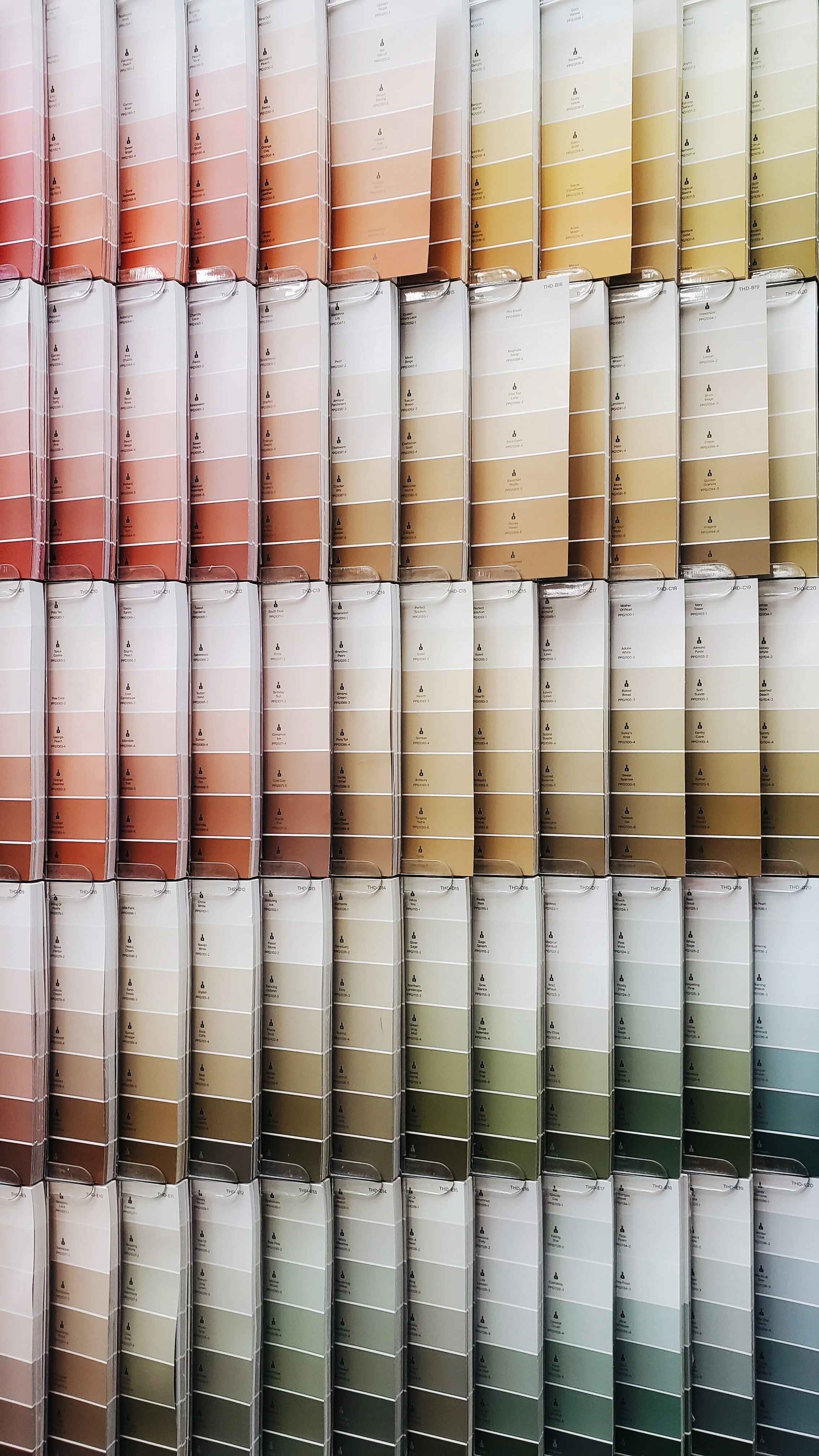
The World's Favorite Color: 50 Shades of Blue

Thinking about using blue in your home? You’re not alone. The color of water and sky is universally popular.  Blue is consistently regarded as the color most people prefer. 

Blue is a complex and sometimes contradictory color, yet it is rich with rewards — if you know how to use it.  There are many shades of blue, so which do you choose?

The Many Moods of Blue

Finding the right blue is determined by matching the tone or shade to the occasion. Let’s explore some of blue’s moods so that we can find the right shade of blue for you and your room.   

• On the dark end of the spectrum, blue invokes trust, intelligence, and authority. 

• A bright blue, in the middle of the spectrum, can suggest cleanliness (thanks to associations with water), strength, or dependability. 

• At the light end of the spectrum, a ‘sky’ blue can inspire feelings of serenity and calm. 

If you’re thinking about how you can use blue, let’s talk first about the room in question and match the use of that room with specific characteristics of blue.  

Putting Blue to Work for You 

When choosing blue for a space, be sure that the room’s function matches the color’s tone. 

If the room is one in which mental stimulation is required, like an office, try a brighter blue – on the darker end of the spectrum. It will help to create an engaging and dynamic mood for the room. From a color psychology perspective, blue is reliable and responsible, so if you want to take on those qualities, work in a darker blue room.

If you have a room in which calm or peace is desired (bathroom, yoga or meditation room), opt for a light ‘sky’ blue. Pale blue can actually lower pulse rate and body temperature, evoking feelings of relaxation. There’s a reason that so many spas include blue in their color palettes!

If you are thinking of painting your kitchen or dining room blue, remember the physical effects of this color.  Because it relaxes the body and lowers pulse rate, it is also reducing metabolism. So food may not taste as good in a blue room. And since blue is rarely seen in fruits and vegetables, it is not thought of as an appetizing color. If blue is your choice for eating areas, try placing blue accessories around the room: rugs, seat cushions, placemats, plates, glassware, vases and flowers. You may find that this is ‘blue enough’ for you.

From ‘blue ribbon’ prizes and IBM’s supercomputer Deep Blue, to the Blue Room in the White House, there are many great reasons for using this soothing color.

by Anjie Cho